Applying Color Theory In Cross Stitch
©All Rights Reserved by Autmly, original image
The first time I stood in front of a wall of DMC threads at my local craft shop, I was taken aback a little bit. I definitely didn’t expect there to be hundreds of colors in different shades, each one subtly different from the next. If I didn’t have years of art education behind my back, I would have felt totally lost, and I imagine some beginners might feel a little confused of it all. Color in cross stitch is a whole topic worth understanding, and learning a few basic color principles can make a huge difference to the finished look of your work.
The Color Wheel Is For Everybody
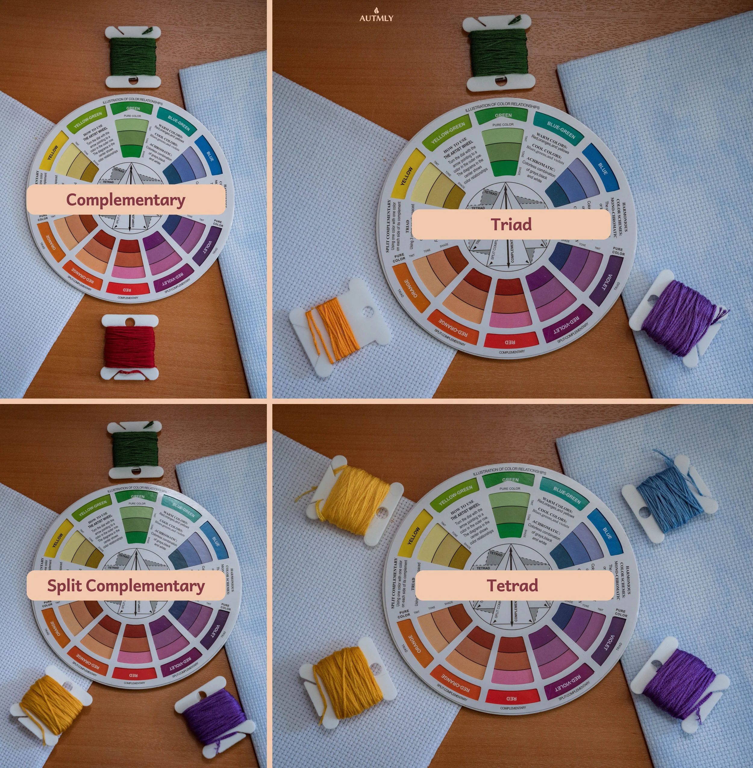
If color theory sounds intimidating, I’m here to tell you there’s nothing scary about it. It’s simply a way of understanding how colors work with each other and the color wheel is not written in some secret language that only artists speak. There are many color wheel tools online, but I personally prefer having a physical one I can reference easily. Now, let’s look at some example color combinations.
Colors that sit opposite each other on the wheel are called complementary colors, and they create strong, vibrant contrast when placed side by side. Like red and green, blue and orange, or purple and yellow. Complementary pairings have a lot of energy, so they tend to work beautifully in bold, graphic patterns or pieces that are meant to really catch the eye.
Split-complementary palettes are a gentler version of the same idea. Instead of picking the color directly opposite yours on the wheel, you take the two colors sitting on either side of that opposite, which gives you contrast and interest without the full tension of a true complementary pair.
Triadic color schemes (sometimes called triad harmonies) take things in a different direction entirely, using three colors spaced evenly around the wheel, like red, yellow, and blue. They feel balanced and lively at the same time, and they are surprisingly versatile in cross stitch.
Then there are tetradic schemes, also known as double-complementary or rectangular harmonies, which use four colors arranged as two complementary pairs. They give you a rich, varied palette to work with, though they do take a little more thought to balance well so that one color does not end up dominating the whole piece.
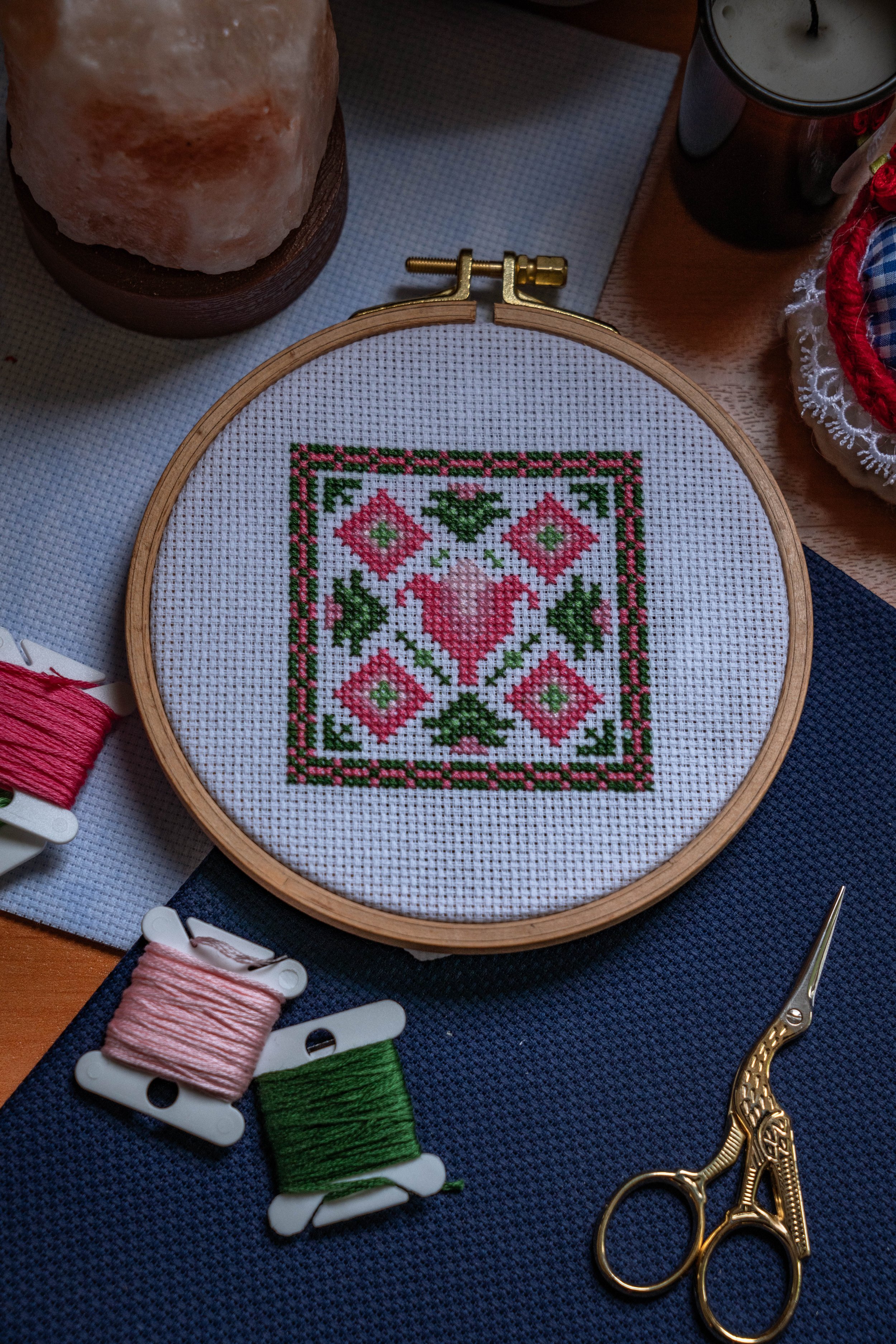
Colors that sit next to each other on the wheel, are known as analogous colors and create a softer and more harmonious look. A palette of dusty rose, lavender, and soft blue-purple will feel calm and cohesive, which is perfect for floral designs or gentle nature scenes.
©All Rights Reserved by Autmly, original image
The color wheel and analogous colors
Warm and Cool Tones
There is also the concept of warm and cool tones. The way you combine them plays a huge role in how your finished piece reads from a distance. For example warm colors like reds, oranges, and yellows tend to come forward visually, drawing the eye toward them. Especially if they are paired with a cool colored background that uses blues, greens, and purples, who naturally recede into the background. Understanding this can help you play around with colors intentionally and create depth.
Warm and cool tones
Values
Another piece of the puzzle are values. This refers to how light or dark a color is, and it is one of the most powerful tools you have for creating contrast and dimension in your work. Even if you are working with a monochromatic palette (meaning shades of a single color), ranging from very light to very dark creates a sense of form and shadow that makes your stitching feel three-dimensional rather than flat. A common beginner’s mistake is choose colors that are all very similar in value, and the result is a design that blends together when you step back. This happens simply because there is nothing to separate one area from another.
Example for values
How to Blend Threads
Now, blending threads is where things can get very interesting. Blending means using more than one strand of thread in your needle at the same time, mixing different colors or shades together to create a new color. Although I’m not using this method myself, in my research I found that this technique can be used for creating gradients. Like shading petals, or giving the impression of texture.
The most common way to blend is to use two strands in your needle at once and choose two threads that sit close together on the color spectrum. If you are stitching a sunset sky, for example, you might combine a warm coral with a soft peach, or graduate through coral to gold as the colors shift across the piece. The blended stitches will appear as a new color that sits visually between the two you have chosen, which allows for far more subtlety than you would get from a single thread alone.
You can also use blending to add a touch of shimmer by incorporating a strand of metallic or specialty thread alongside a regular cotton thread. Just keep in mind that specialty threads can behave a little differently to cotton, so it is worth stitching a small test section first to see how they sit together before committing them to your main piece.
A Little Tip
When you are putting together a color palette for a project, one helpful habit is to lay your chosen threads out next to each other on a white surface and look at it in natural light. This lets you see how the colors interact and spot any clashes or gaps in your values before you have spent hours stitching. Squinting at your palette slightly can also help, because it blurs the hues and lets you see the contrast between light and dark much more clearly. What I personally do is stitching few samples on a spare piece of Aida to see how the colors look together and make any adjustments there. It really saves you a lot of trouble later.
Have Fun With It
Choosing your colors is one of those things in cross stitch that gets easier and more intuitive the more you play with it. Maybe it won’t click at first but you just need more testing and a lot of experimenting. Once you know the basics and start noticing value, thinking in terms of warm and cool, you’ll eventually be able to create palettes that feel unique to you.